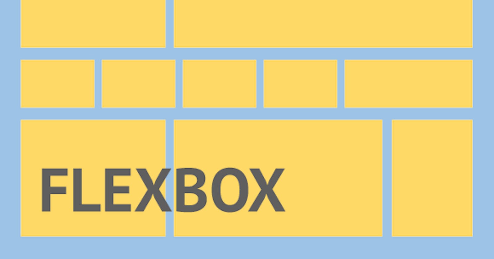


WHAT IS A FLEXBOX?
- Flexbox is a one-dimensional layout method for laying out items in rows or columns.
CSS flexbox is a better way to align items into a container.
The name Flexbox come from Flexbox = flexible + box
FLEXBOX AXES
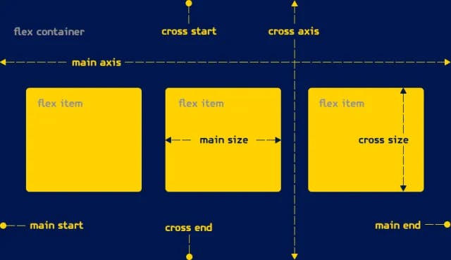 When elements are laid out as flexible boxes, they are laid out along two axes.
How to create a flex box.
<!DOCTYPE html>
<html lang="en">
<head>
    <meta charset="UTF-8">
    <meta name="viewport" content="width=device-width, initial-scale=1.0">
    <title>CSS Flex Tutorial</title>
</head>
<style>

    #Wrapper{
        display: flex;
        border: 2px solid black;
    }
    .box{
        background-color: cyan;
        margin: 60px 40px;
        height: 200px;
        width: 200px;
        border: 2px solid red;
    }
</style>
<body>
    <div id="Wrapper">
        <div class="box" id="item1">Item First</div>
        <div class="box" id="item2">Item Secound</div>
        <div class="box" id="item3">Item Third</div>
    </div>
</body>
</html>
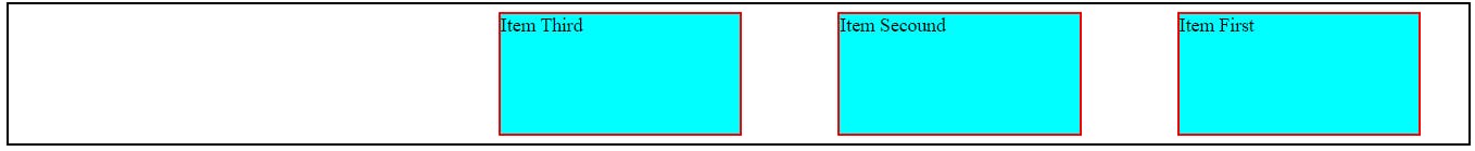
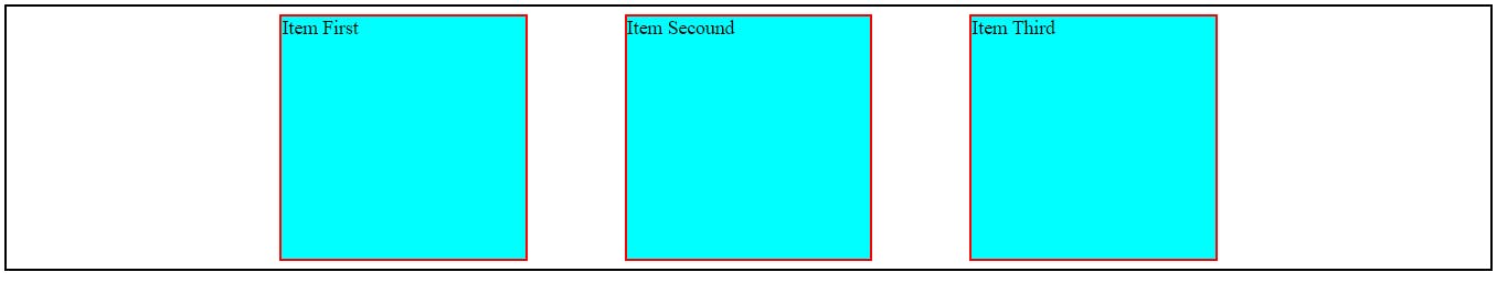
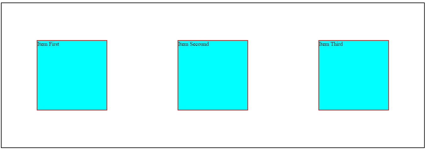
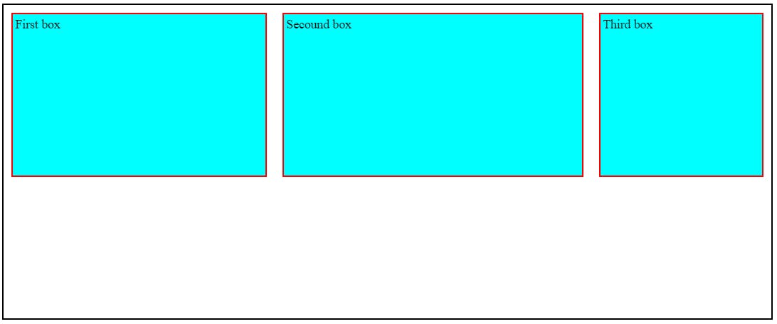
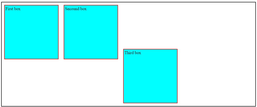
The Flexbox Created by above code.
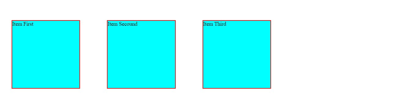
By Default the direction of the Flexbox is Row.
Flex Properties for flex container.
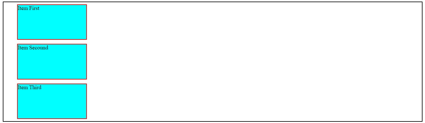
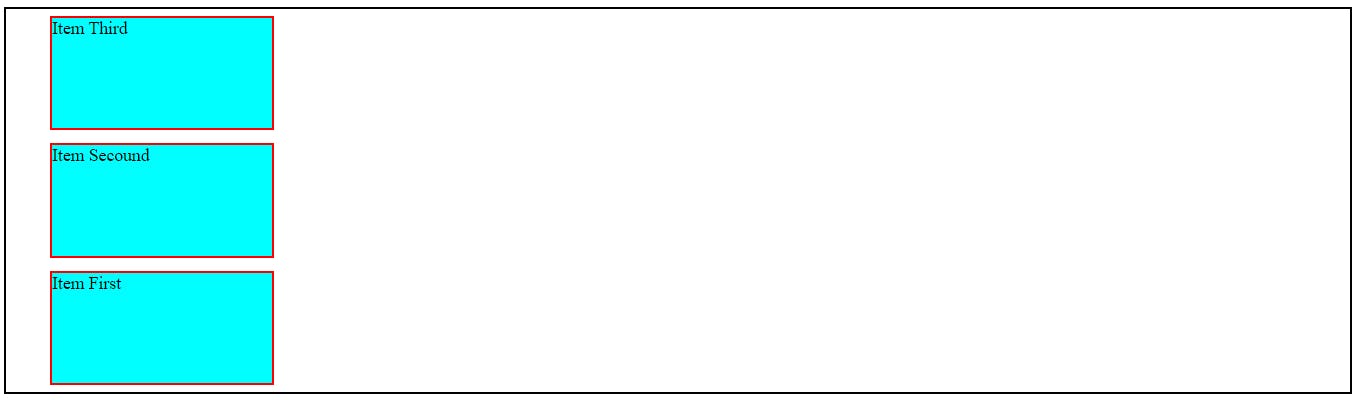
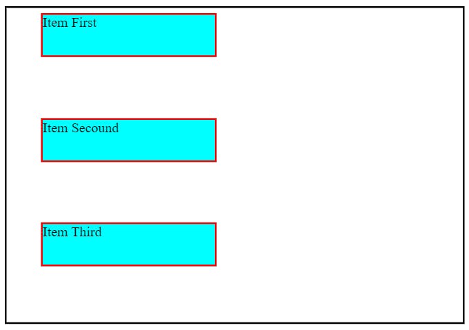
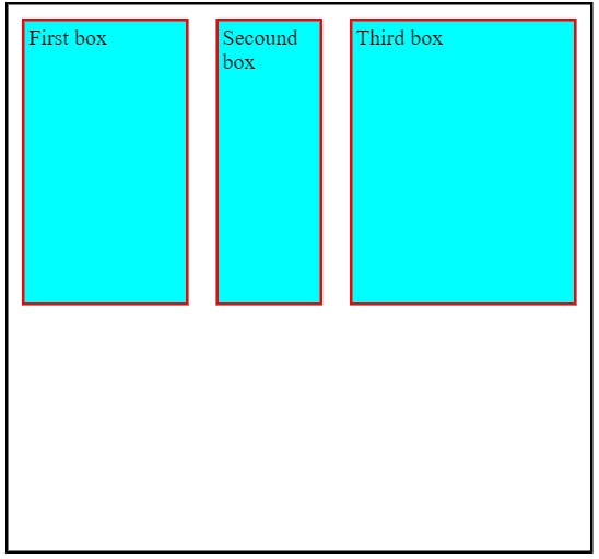
1.Flex Direction property.
flex-direction: column;
flex-direction: row-reverse;
flex-direction: column-reverse;
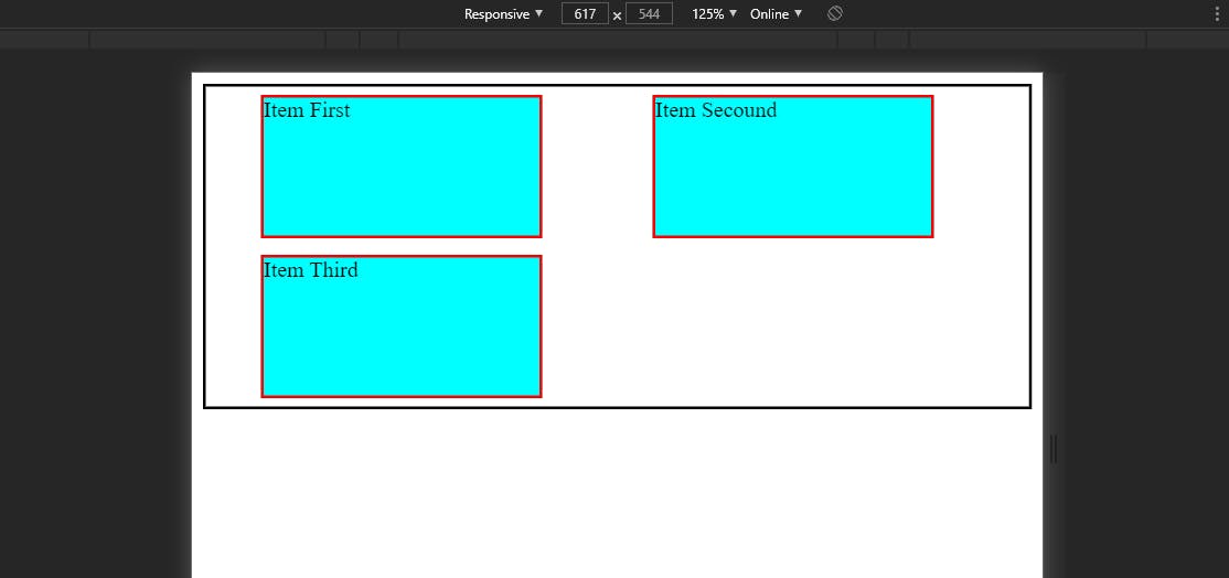
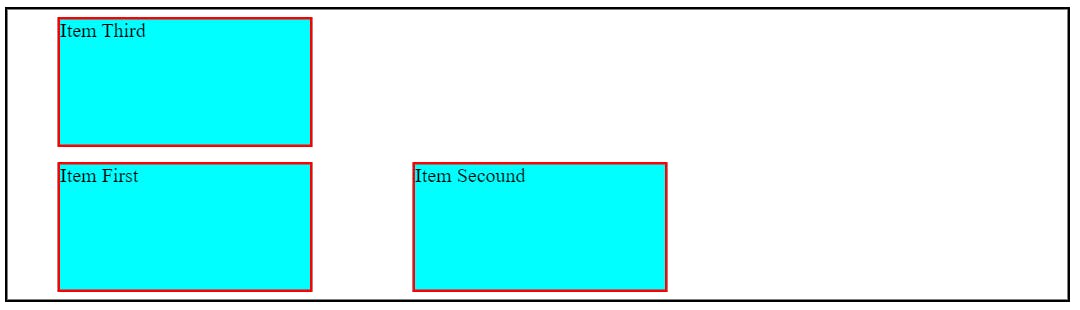
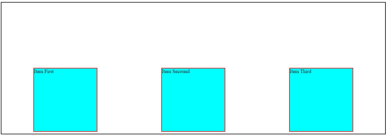
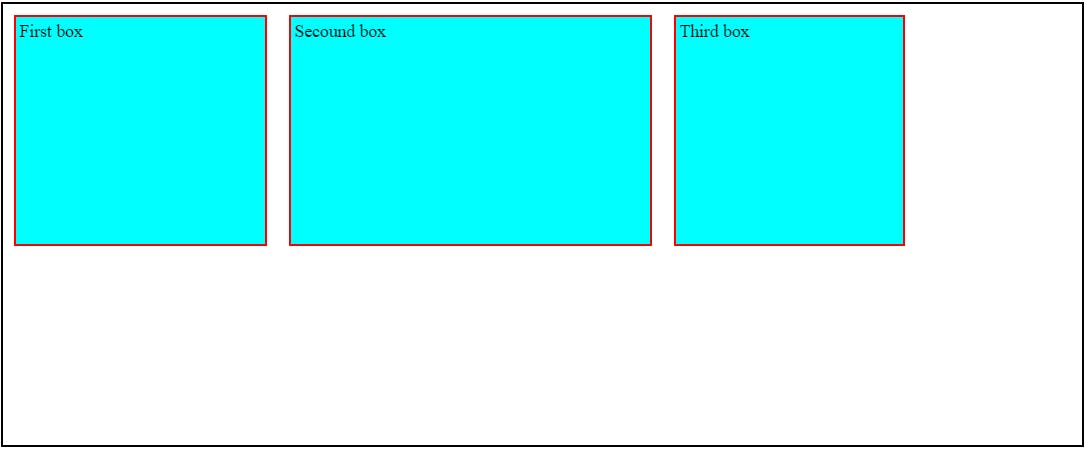
2. Flex Wrap property.
It is basically used to create our website Responsive.
/* By Default the value of flex-wrap is No Warp */
flex-wrap: wrap;
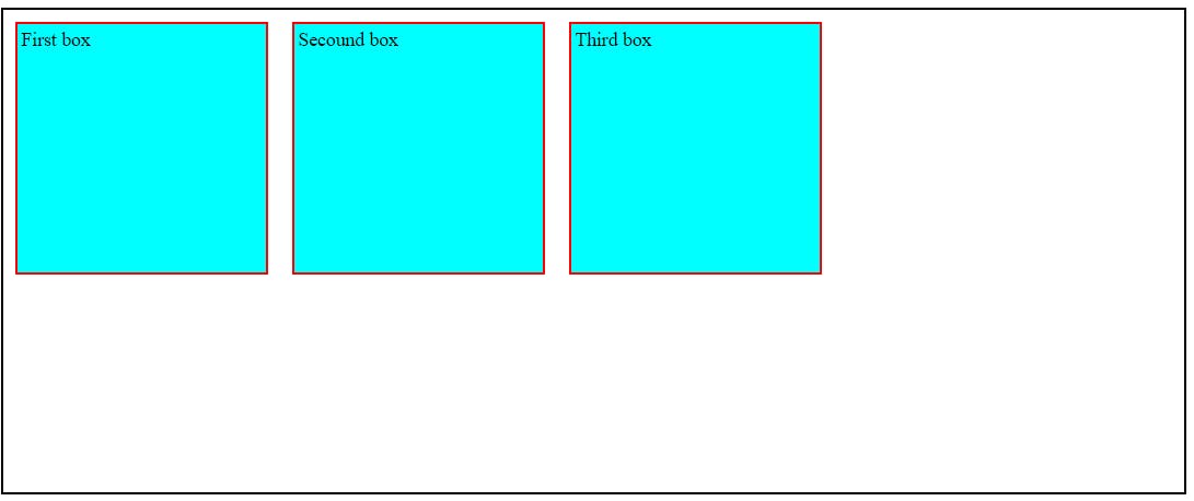
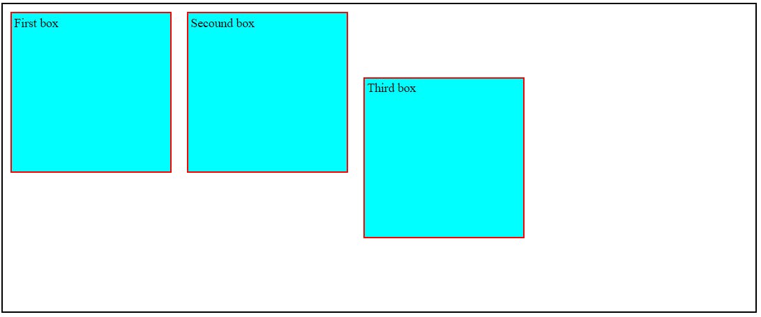
When we wrap out the container using our Browser Developer tool than the item present inside the container also Start Wrapping According to the size of the container as shown below.
flex-wrap: wrap-reverse;
Short hand to set direction and wrap with single command.
flex-flow: column wrap;
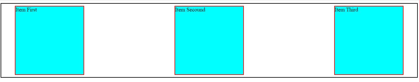
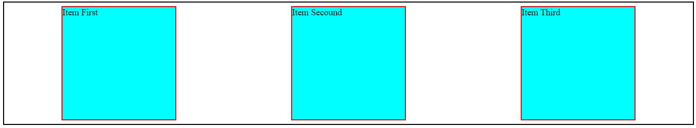
3. Justify-content property.
The Justify-content property aligns the flexible container's items when the items do not use all available space on the main-axis.
justify-content: center;
align your content in center.
justify-content: space-between;
justify-content: space-evenly;
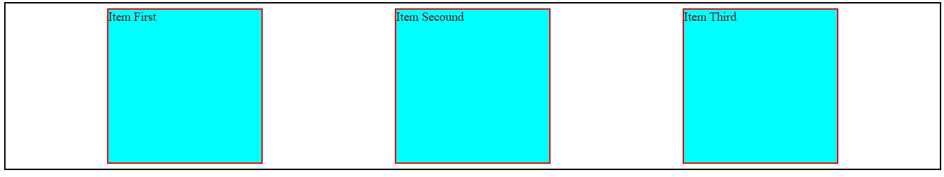
justify-content: space-around;
4. align-items property
align-items: center;
It will center the item vertically.
align-items: flex-end;
align-items: flex-start;

align-items: stretch;
Align equal gap between each item vertically.
Flex property for flex Item.
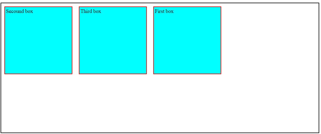
1. Order property.
 #item-1{
            order: 2;
        }
Higher the order, later it shown up in the container
2.Flex-grow property.
#item-1{
     flex-grow: 2;
}
#item-2{
     flex-grow: 3;
}
The item with more value of flex-grow increase there width more rapidly as compare to other item when the width of your screen increase.
3.Flex-shrink property.
#item-1{
     flex-shrink: 2;
}
#item-2{
     flex-shrink: 3;
}
The item with more value of flex-shrink. The width of that item decrease more rapidly as compare to the other item present in the container. while the width of the screen is decreasing.
4. Flex-basis property.
We use This property when we want to set some default value of the particular item present in the container.
#item-1{
   flex-basis: 220px;
}
#item-2{
    flex-basis: 320px;
}
When the Flex-direction is set to row. It will applied on the width of the container and when the flex-direction is column than it will applied to the height of the container.
5. Align-Self property.
#item-3{
    align-self: flex-start;
}
This will put your item in the starting of the flex.
#item-3{
    align-self: flex-end;
}
This will put your item in the Ending of the flex.
#item-3{
    align-self: center;
}
This will put your item in the center of the flex.
If you enjoyed the content write me on Twitter.
Thanks for reading and happy coding!